To be a successful leader in the modern finance workplace, you need to be fluent in data analysis and visualization. Data visualization tools help you quickly compare large volumes of data and easily identify patterns that aren’t immediately available in blocks of text. Good data visualization also makes it easier to communicate detailed concepts to other people.1
There are many ways to share your information as graphical representation—histograms, bar charts, heat maps, pie charts, tree maps, box plots, and word clouds, among others—so you have lots of options when it comes to presenting complex data to diverse audiences.2 Keep reading to explore the techniques and tools involved in data analysis and visualization.
Data Analysis and Visualization in Specific Domains
Expertise with different data visualization techniques will empower your success in many realms of business. For example:
- In marketing and consumer analytics, data visualization helps display a variety of information—from website and campaign analytics to return on ad spend3
- Marketers can use data visualizations to analyze customer behavior, such as the geographic location of large target markets
- Financial analysts often use visualization to highlight historical data such as performance trends, annual sales, profit margins, and other metrics
- Data analysts in healthcare use these techniques to improve customer service, analyze customer feedback, understand average wait times and visit lengths, and monitor community health4
- Operations and supply chain managers may use data visualization to analyze the total time to delivery or to strengthen their inventory management practices
Data Preparation and Cleaning
Before you can create eye-catching charts and graphics, you need to prepare. First, determine what you want to communicate in your report, so you know which data points to highlight through visualizations. By having a clear goal, you can decide which visualization tools would work best to communicate your key points.
Next, prepare and clean your data. In the data cleaning process, you identify and fix inaccuracies in your raw data.5 Tools including OpenRefine and Winpure are designed for this purpose. They sift through large volumes of data, remove duplicates and irrelevant data, fix errors, and standardize your formatting.
Exploratory Data Analysis
Once you have cleaned your data, exploratory data analysis (EDA) will give you a better idea of potential patterns. It also helps you identify outliers. You'll perform EDA before running a statistical analysis on your data.6
During the EDA process, you recognize how your data is distributed. You also measure your median and mode and set your acceptable variation range. For example, if you were measuring total sales for a quarter, the median might be the average dollar value of each sale, and the mode would be the dollar value that appears most often in the report. Particularly small and large dollar values would be considered outliers and could skew your overall data. If you wanted a better picture of average sales, you might throw out these outliers.
At this stage, you can build visualizations to distinguish sales patterns and other relationships such as sales volume by region or by month. Creating charts and graphs will give you an idea of distribution and patterns.
Data Analysis Techniques
Once you’ve prepped your data and run a preliminary analysis, you can choose which statistical data analysis techniques you will use to assess your data. There are many, and the following are some of the most common.
Regression analysis helps you determine whether one variable correlates with another.7 You might, for example, use correlation and regression analysis to explore the relationship between inflation and new home sales.
Time series analysis involves modeling data over a certain period of time.8 This technique is helpful for assessing seasonal patterns, quarterly patterns, and other cycles between set dates.
Cluster analysis allows you to identify patterns and relationships between various groups within your initial dataset.9 Businesses might use cluster analysis to divide their customers into different groups to develop specific marketing messages for each segment.
Data Visualization Techniques
Once you’ve analyzed your data, you'll be ready to choose which data visualization techniques to use.
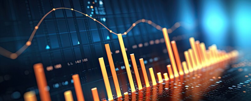
Charts and graphs are a basic technique for visualizing data. They’re easy to use and immediately recognizable to the people reading your reports, and they offer an effective way to compare variables.
Interactive dashboards display multiple data sets for a comprehensive picture of a business.10 You could use them to evaluate multiple metrics in one location. Financial data scientists might use an interactive dashboard to show total sales, the average sale per customer, the return on investment for marketing spend, and the average value per lead.
Geographic visualization lets you review data on a map.11 You may use it to compare economic conditions across the country. This tool, for example, could help you understand the hottest geographical customer bases for a given company.
Network visualization displays the links between various data points. This is a good tool for regression and correlation analysis, as it highlights the connections between your data.12 Correlation examines the degree to which two pieces of data are related, while regression typically examines the relationship between two variables in more detail. For example, if you are evaluating seasonal sales volume, you might learn that sales rise during a certain time of year with correlation analysis, and you could use regression analysis to find out why.
Tools for Data Analysis and Visualization
There are multiple tools on the market that let you create data visualizations with a big data set. One of the simplest and most well-known is Excel. This MS Office tool is a spreadsheet maker that also allows you to create graphs and charts, pivot tables, and calculations.
If you want more intricate visualizations, you might consider Python. This programming language offers multiple libraries for creating graphs, scatter plots, histograms, and more.13
R is an advanced language that offers a wider range of statistical analysis.14 R’s Ggplot 2 library, dplyr, plotly, and other packages offer interactive graphics for multiple types of data.
If you’re unfamiliar with R, you can use a program such as Tableau to visualize your data. Tableau offers drag and drop to make uploading data easier. It also uses artificial intelligence to create intelligent predictions and recommendations.15
Many businesses use Power BI to create dashboards. BI tools allow you to assemble your data into one location and export it into visually appealing charts and infographics.16
Advanced Techniques in Data Analysis and Visualization
Power BI and other business intelligence tools offer advanced technology for data visualization. Power BI uses machine learning and artificial intelligence to predict patterns. Other AI tools use natural language processing (NLP) which allows data analysis programs to process and interpret language. With these tools, you can obtain deeper insights into data without having to run multiple queries.17
AI also makes it easier to evaluate image and video datasets without extracting and entering data.18 With these tools, including 3D modeling, you can make your data more interactive and engaging. Deep learning and neural networks are more sophisticated AI tools that delve even deeper into data mining, allowing them to identify data errors, interpret data, and more.19
Data Storytelling and Presentation
Having completed careful data analysis and put your findings into graphic form, you will be ready to share them with company leaders, clients, and other stakeholders. When it comes to presenting data effectively, follow these essential steps:
- Articulate your goal for running the data analysis
- Explain your process for collecting and analyzing the data
- Use key visualizations to illustrate each point
- Finish your narrative with valuable insights or recommendations based on your data20
Remember: Presenting your information as a story engages your audience and helps them retain what you’ve said. Encourage them to ask questions. This turns them into active participants in a conversation rather than passive recipients of a lecture, and it gives you the chance to come through with detailed answers.
Prepare for leadership in financial data science.
Santa Clara University’s Online Master of Science in Finance and Analytics will position you for success in a wealth of careers involving data analytics. This flexible online program will instill the expertise you need to guide strategy and business success.
Created and led by world-class faculty experts, the innovative curriculum includes experiential learning, providing you with the opportunity to stand out from the crowd while completing your degree.
Accelerate your advancement into business leadership. Schedule a call with an admissions outreach advisor today.
- Retrieved on November 20, 2023, from deloitte.com/nl/nl/pages/tax/articles/bps-the-five-benefits-of-data-visualization.html
- Retrieved on November 20, 2023, from ibm.com/topics/data-visualization
- Retrieved on November 20, 2023, from blog.coupler.io/marketing-data-visualization/
- Retrieved on November 20, 2023, from ncbi.nlm.nih.gov/pmc/articles/PMC9741729/
- Retrieved on November 20, 2023, from knowledgehut.com/blog/data-science/data-cleaning
- Retrieved on November 20, 2023, from geeksforgeeks.org/what-is-exploratory-data-analysis/
- Retrieved on November 20, 2023, from careerfoundry.com/en/blog/data-analytics/data-analysis-techniques/
- Retrieved on November 20, 2023, from itl.nist.gov/div898/handbook/pmc/section4/pmc4.htm
- Retrieved on November 20, 2023, from displayr.com/understanding-cluster-analysis-a-comprehensive-guide/
- Retrieved on November 20, 2023, from phocassoftware.com/resources/blog/what-is-an-interactive-dashboard
- Retrieved on November 20, 2023, from rst.software/blog/14-use-cases-of-geospatial-data-visualization
- Retrieved on November 20, 2023, from netbraintech.com/blog/what-is-network-visualization/
- Retrieved on November 20, 2023, from kdnuggets.com/2022/12/python-used-data-visualization.html
- Retrieved on November 20, 2023, from geeksforgeeks.org/r-programming-for-data-science/
- Retrieved on November 20, 2023, from tableau.com/data-insights
- Retrieved on November 20, 2023, from microsoft.com/en-us/power-platform/products/power-bi/
- Retrieved on November 20, 2023, from optimussbr.com/natural-language-in-data-visualization-a-showdown-between-tableau-and-power-bi/
- Retrieved on November 20, 2023, from dl.acm.org/doi/full/10.1145/3576935
- Retrieved on November 20, 2023, from ibm.com/topics/neural-networks
- Retrieved on November 20, 2023, from techtarget.com/searchcio/definition/data-storytelling